Friday, January 29, 2010
Tuesday, November 18, 2008
It Is done.
Finally, we finished the urort project.
Statement
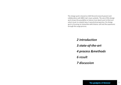
The project explore the possibilities for listener to find and select music by relative gadgets and interactive tools.
DEMO
The project report

5 Discussion
The gadgets of listener
In working through the whole design process, there are several points make
me rethink in further design.
First, for the concept itself, the different way in music finding and selecting
send the value to inspire the data arrange in web service. And the interactive
tools which afford user a playful sense to explore the favorite collection,
those detail experience is better than just click the “add to playlist” button as
regular. In further work, I may keep these small particular parts.
Second, stand for social perspective, all those gadgets sharing the music
popularity data which input by other online users. But in the project demonstration,
some of sharing process is hiding behind, only the friends&music
gadget set out a simple example that perform how user get music through
friends listening trace. For the next picture, I will put more attention to build
the bridge in social communicate between users.
Third, the layout of visualization in this project now looks very orderly which
is easy for user to focus on the creative shift in some way. But here still need
to think about some other directions that not limited in just square window
and laying the album pattern in line.
In conclusion, during this project, I thought it is hard to bring the first impression
idea to the final demonstration. The balance between the core parts
which is framed a social space for urort user and the creative concept that is
marched the need to attract more listeners for urort web site are not easy to
harmonize. However, as an attempt of solid solution in further, this work still
has some redeeming feature for reference. And I believe the interesting and
engaging points is valuable in developing phase.
at
4:46 AM
Posted by
ff
![]()
Monday, October 6, 2008
MAIN TAST 1-URØRT MUSIC WEB 4

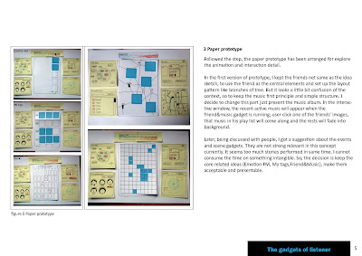
I have to say that is a effectual tool to work in process. Compare last week,i made some change in this new prototype model.since the middle field will be present a interactive ground for music display and select,except the Events and Scene tool.the initial idea of friend& music is distributing like a net,friends link to music or music link to friends,but here i will keep the music first principle. All recent music will appear ,when you choose one of the friend image, those music in his play list will come forward and rest will fade into back ground.
at
9:35 AM
Posted by
ff
7
comments
![]()
Friday, September 26, 2008
MAIN TAST 1-URØRT MUSIC WEB 3
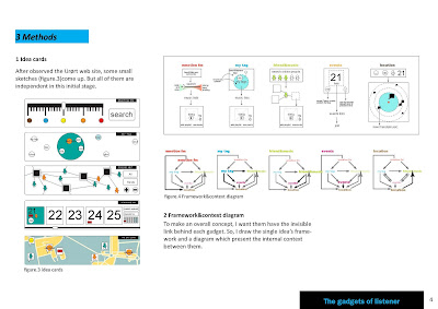
 Diagram
Here is the connection diagram of each tools,i try to define how the function transferring between each other.
for example,my tag relative the friends&music,events and location.when you see your friends music pool,all those music in your tag list will being preferred,same as the events and location tool.
at
6:28 AM
Posted by
ff
300
comments
![]()
Monday, September 22, 2008
MAIN TAST 1-URØRT MUSIC WEB 2
 thought 2
Interested me- is a events calendar, which recommend the relevant events at weekend and specific time for user
we are same-Present all information inside a map, the user can find the same interest points from people which live nearby.
After observation for the UrØrt website, i choose MY site as my main part to focus on, design for the listener's perspective and give them the flexible options to play with.
at
1:40 AM
Posted by
ff
0
comments
![]()


